Ink Grade Estate sits nearly 1,800 feet above sea level on Howell Mountain in Napa Valley, a remote and rugged volcanic area. The steep terrain is covered in eucalyptus and shaped into terraces where vines grow organically, creating a feeling of timelessness. Although the estate is far from the winery’s tasting room in downtown St. Helena, the brand experience is designed to make visitors feel as though they are connected to the wildness of the mountain, no matter their location.
Edition Shapes Ink Grade’s Multi-Sensory Brand Experience, Bridging Estate and Tasting Room
Edition, a design studio based in San Francisco and Portland, has played an essential role in shaping Ink Grade’s immersive brand experience. Over the years, the studio has created a multi-sensory identity that blends visual and tactile elements, including custom labels, tasting materials, and interactive design features. Their work has made the brand feel rooted in the natural world, while still being adaptable and engaging for visitors who may not be familiar with the estate’s physical location.
How Edition Brings Howell Mountain’s Essence to Life in Ink Grade’s Tasting Room Design
To overcome the physical distance between the estate and its tasting room, Edition used tactile design elements to evoke a sense of place. A two-ton boulder from the estate is a central feature in the tasting room, bringing a tangible piece of the mountain inside.
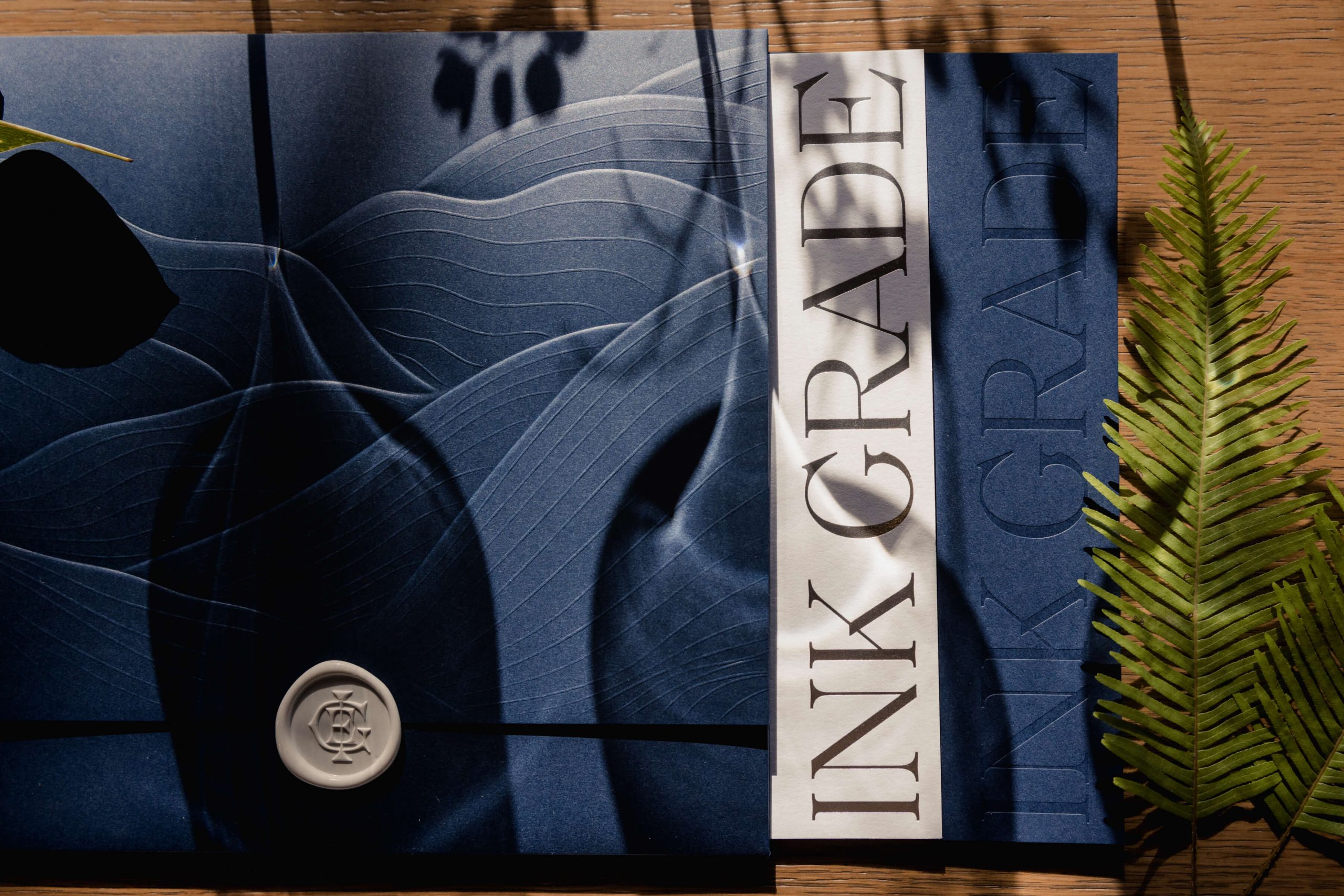
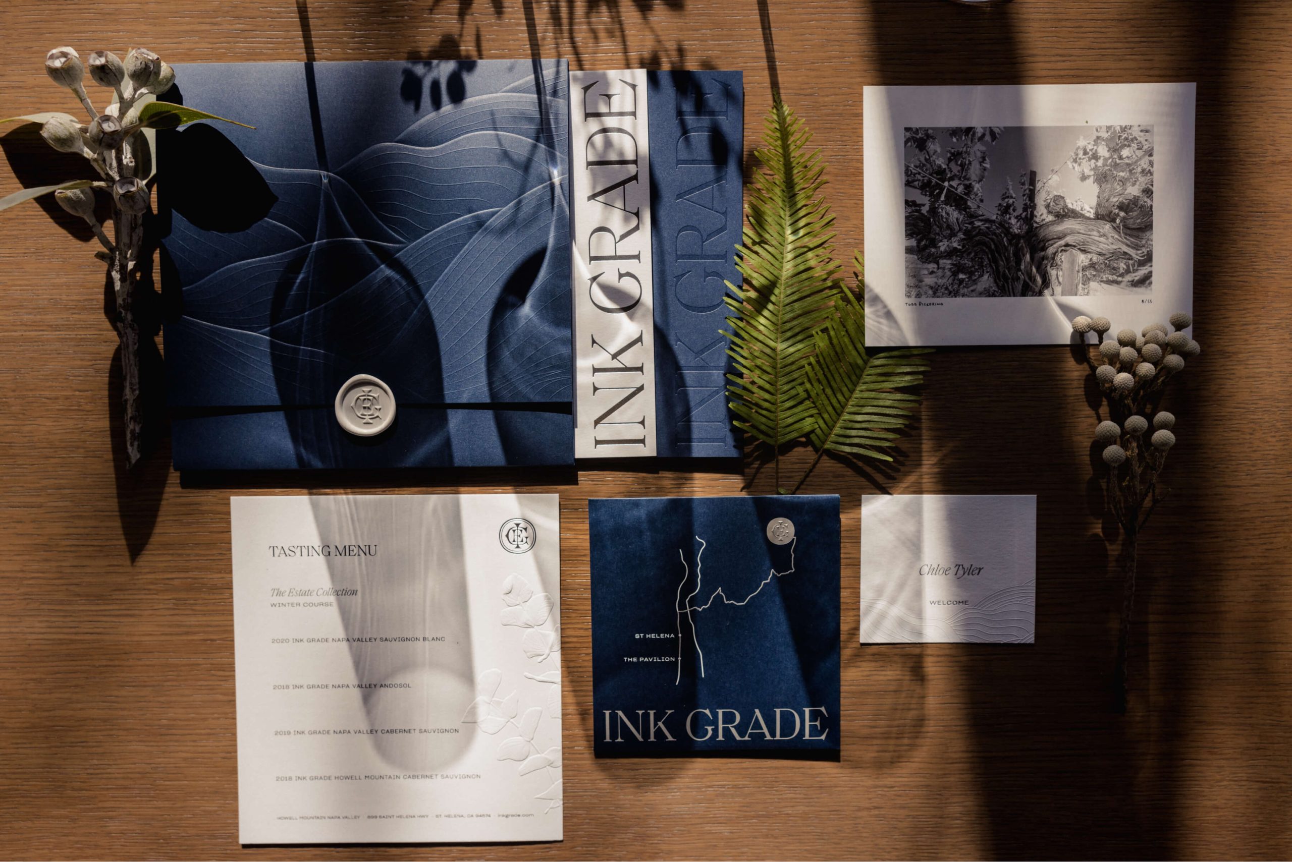
Additionally, custom folders and menus are made from thick, textured paper with blind embossing, mimicking the contours of the mountain. The eucalyptus plant, which grows abundantly on Howell Mountain, is subtly incorporated throughout the space, reinforcing the connection to the estate.
Emphasizing Subtlety and Craftsmanship, Edition Creates a Cohesive, Immersive Brand Identity
Edition’s design philosophy focuses on restraint, choosing specific details that contribute to the overall experience without overwhelming the senses. The textures of the materials used—such as the sculpted embossing and the weight of the paper—convey care and craftsmanship without being too loud or flashy.
This approach is also reflected in the brand’s labels, which feature vintage lithographs of California wildlife. These images, sourced from historical archives, pay homage to the early settlers and their respect for the land, aligning with the winemaker’s approach to crafting wine with an appreciation for the natural environment.
The attention to detail and consistency across all design elements have created a strong, interconnected brand for Ink Grade. Even the most functional items, such as menus and tech sheets, are crafted with the same level of care, ensuring that each piece contributes to the overall experience.
Edition’s strategic approach to defining core design elements early on has allowed the brand to evolve while maintaining a cohesive identity. This long-term collaboration has allowed Ink Grade’s brand to feel like a living, breathing entity that invites visitors to connect with the land, even if they never visit the estate in person.